Visual Design portfolio
Art catalogue.
Matchbox labels.
Development and production of graphics and motion design for Bedre Nætter campaigns, ads, print and website.
Project summary
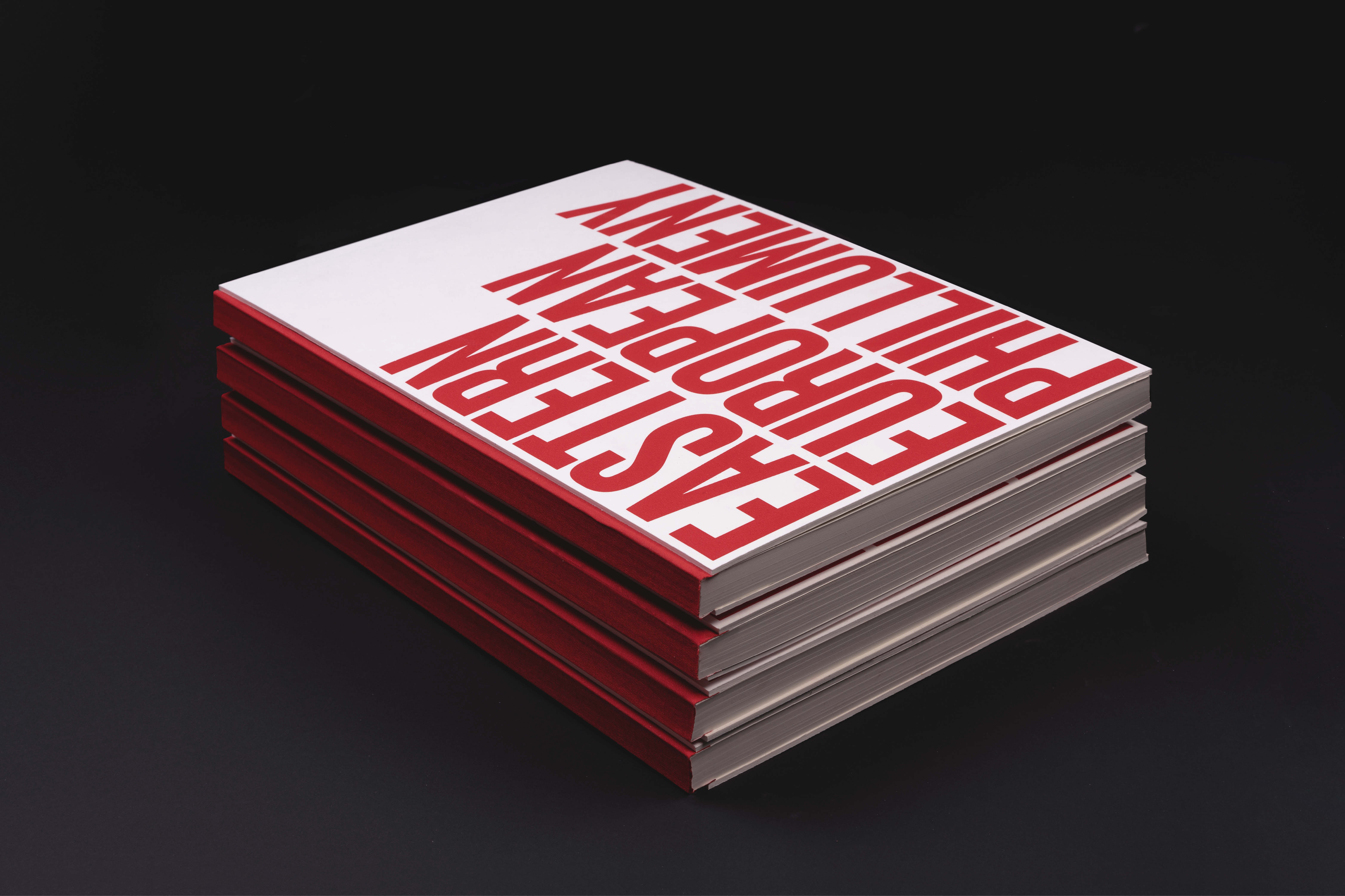
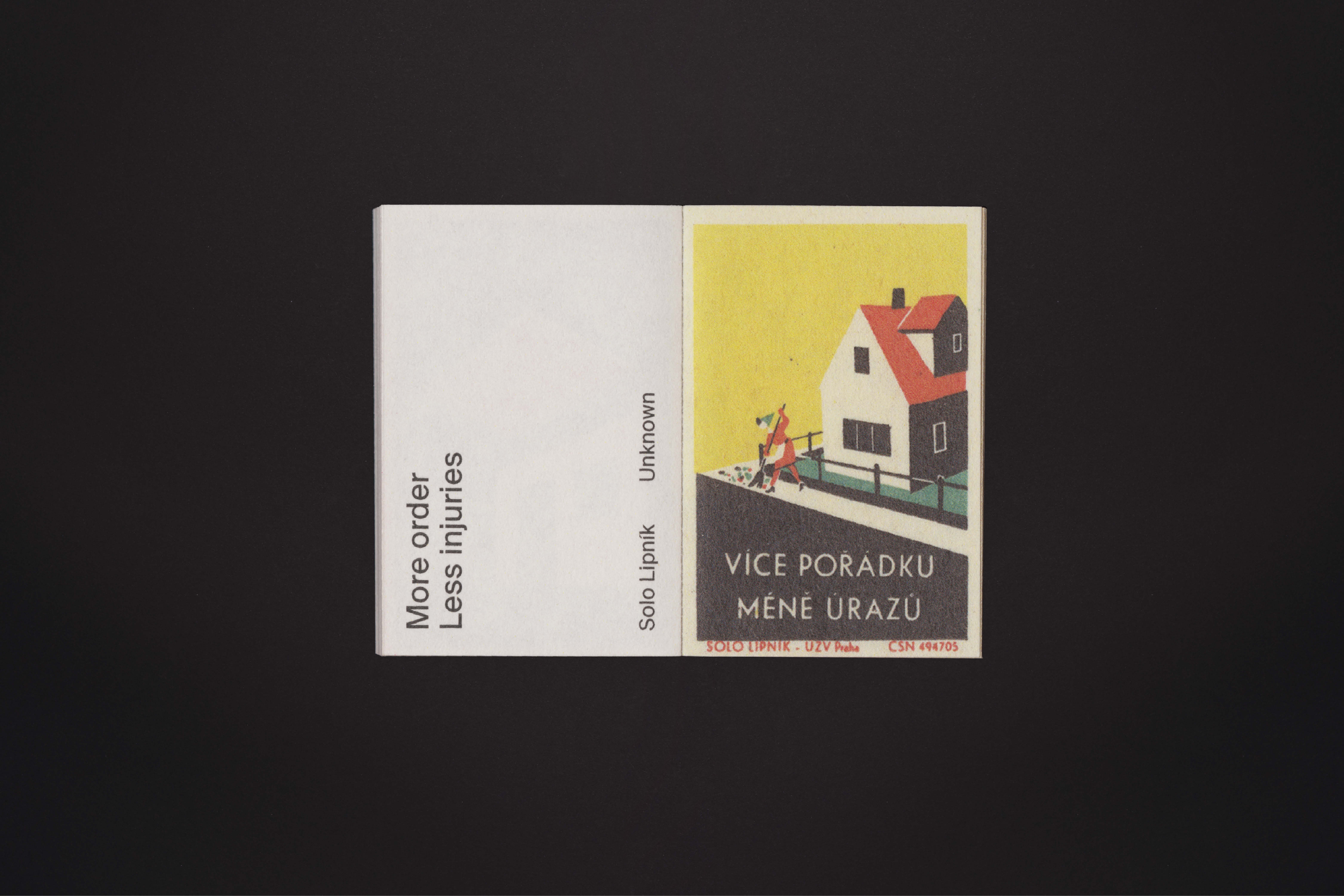
The matchbox labels shown in this art catalogue are the product of three Czechoslovakian factories. They were found in an online gallery featuring over 2800 of such illustrations. While the purpose of these rather mundane matchbox label graphics was mostly public information in the Soviet Union, the act of making a selection and showing it in art catalogue claims that their status is more than just everyday graphics. They should be seen as valuable pieces of art.
Services
Editorial Design
Screen Printing
Screen Printing
Collaboration
David Gobber
Fabio Mario Rizzotti
Fabio Mario Rizzotti


Two books
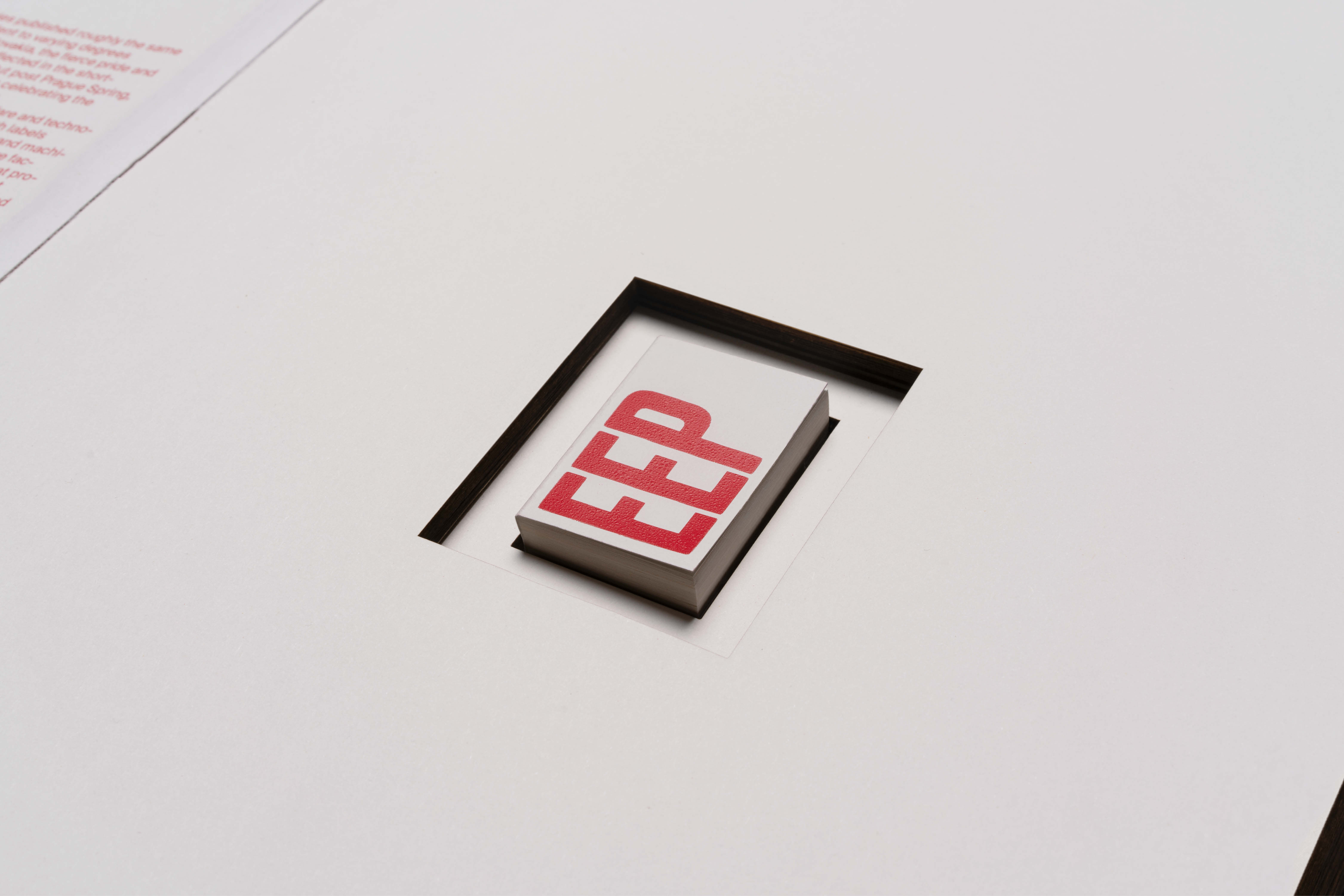
The art catalogue consists of two books, with the smaller volume placed in a cavity burned into the book block of the larger one. While the smaller book contains the illustrations, the larger book functions as a “white cube” container.
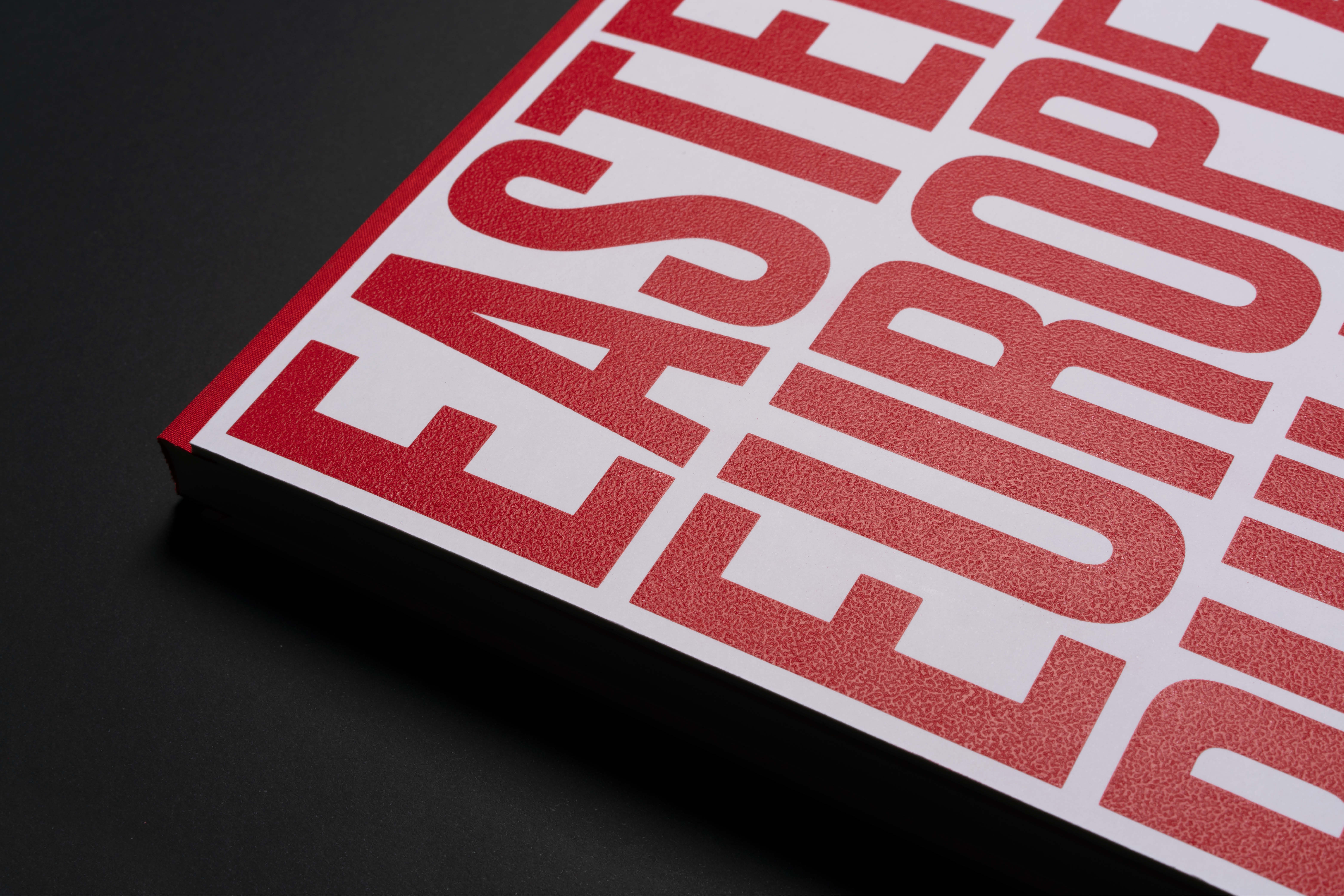
When screen-printing the covers, we added a subtle grain to the ink as a reference to the red phosphorus and powdered glass used to ignite a match.
When screen-printing the covers, we added a subtle grain to the ink as a reference to the red phosphorus and powdered glass used to ignite a match.
The art catalogue consists of two books, a smaller one being placed in a hole burned out of the book block of the larger one. While the smaller book contains the illustrations as well as additional information about each illustration, the larger book functions as a “white cube container”.


Art catalogue.
Matchbox labels.
+ View project details
Development and production of graphics and motion design for Bedre Nætter campaigns, ads, print and website.
Project summary
The matchbox labels shown in this art catalogue are the product of three Czechoslovakian factories. They were found in an online gallery featuring over 2800 of such illustrations. While the purpose of these rather mundane matchbox label graphics was mostly public information in the Soviet Union, the act of making a selection and showing it in art catalogue claims that their status is more than just everyday graphics. They should be seen as valuable pieces of art.
Services
Editorial Design
Screen Printing
Screen Printing
Collaboration
David Gobber
Fabio Mario Rizzotti
Fabio Mario Rizzotti
Eastern European Phillumeny
The matchbox labels shown in this art catalogue are the product of three Czechoslovakian factories. They were found in an online gallery featuring over 2800 of such illustrations. While the purpose of these rather mundane matchbox label graphics was mostly public information in the Soviet Union, the act of making a selection and showing it in art catalogue claims that their status is more than just everyday graphics. They should be seen as valuable pieces of art. The art catalogue consists of two books, a smaller one being placed in a hole burned out of the book block of the larger one. While the smaller book contains the illustrations as well as additional information about each illustration, the larger book functions as a “white cube container”.